
Exhibit B
Westmoreland Museum of American Art - Greensburg, PA

NB: This is a repost from a museum report I wrote two years ago. Pulling it out of the paid archives for your reading pleasure. Huzzah!
We really cannot discount small, local galleries and museums as being “regional” in a derogatory sense. They’re anything but. Most art museums are simply not that big in terms of their collections, influence, endowments, or activity. But that’s true for damn near anything. And because it’s universally true, “size” simply should not be taken into account when judging a museum1. Nowhere have I seen this more true than at the Westmoreland Museum of American Art.
Truthfully, it’s not even that small of a museum. It’s no Hermitage, but, again, what is?
This is a really long post. It even has subheadings! I considered breaking it down into multiple posts. But I decided against serial posts about the same museum because I only post weekly, and didn’t want to delay other posts from publication. So, I settled on breaking my “keep it to 500-800 word count” rule, and to instead go hog-wild. Because there was just too much to ignore from The Westmoreland.
Wyeth
When I visit museums, I do not do my research. Maybe that’s foolish of me, but I like to be surprised. And what surprised me the most about The Westmoreland was its awesome collection of Andrew Wyeth paintings2. My love of the Wyeth’s is directly owed to Ivan Fortushniak, who used a number of their works, along with those of Winslow Homer, in his own landscape watercolors and oils3. This was really my first time seeing Andrew’s work outside of Ivan’s collages, and I’ve since purchased Duff’s An American Vision: Three Generations of Wyeth Art : N.C. Wyeth, Andrew Wyeth, James Wyeth, to learn more.
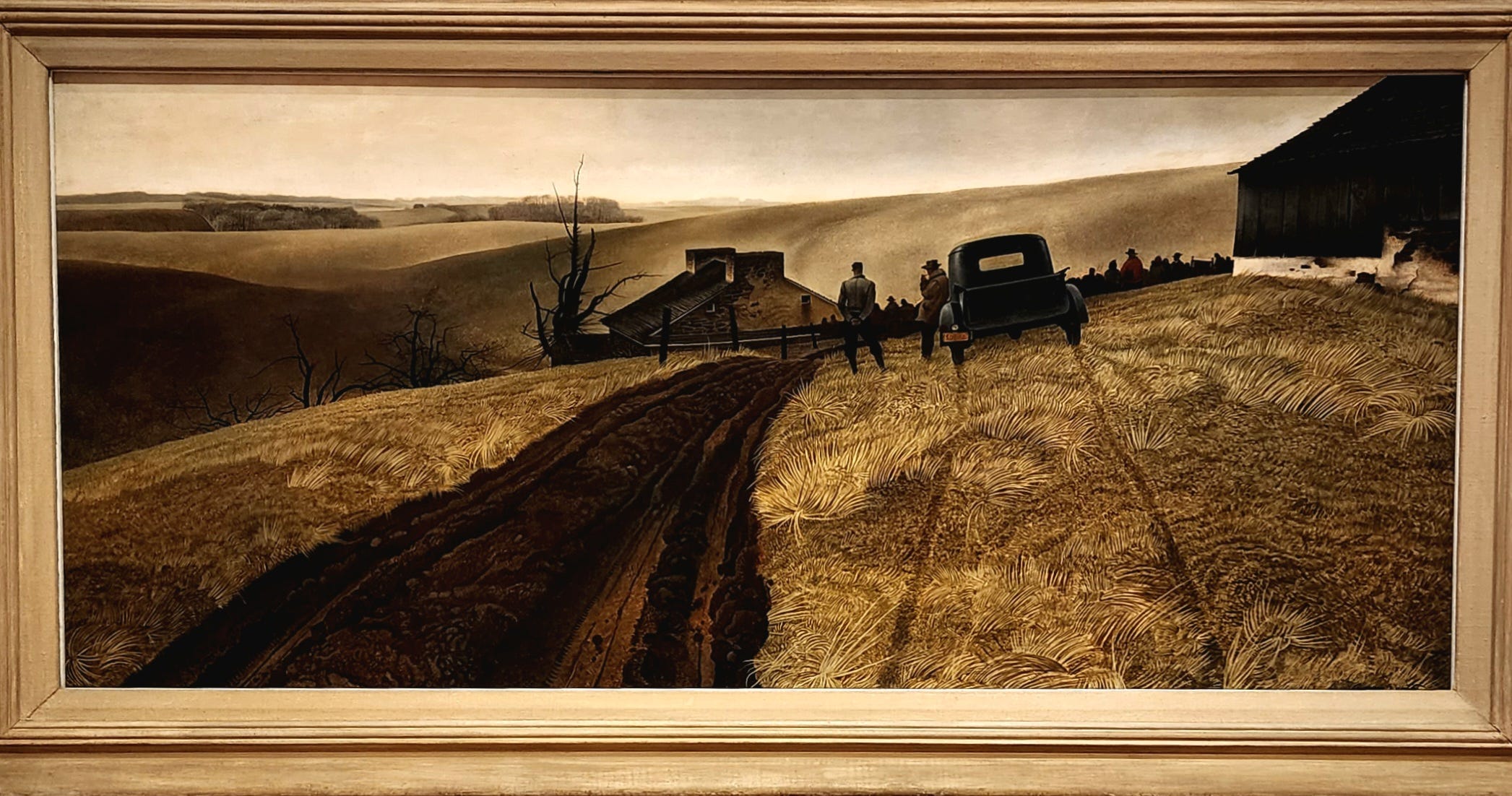
Public Sale was the first Wyeth painting that caught my eye, initially because of the strong lines from the road and the tire tracks that pull the viewer into the picture with incredible force. Given that the subject matter is the foreclosure of a farm this effect is especially salient. And there’s a callousness in how the automobile driver not only leans uncaringly against the truck’s door, but also in how he didn’t even bother to drive on the actual road, choosing instead to demonstrate his apathy to the owners’ plight by damaging their property.
But what kept me lingering on this image was the sharp angles of the man standing next to the truck driver. There’s an incongruence to the shape of the figure that breaks up the more rounded patterns that Wyeth has already established. I think it’s this juxtaposition of an older way of painting - something blearily like the Hudson River School - and a more recent illustrative style that is reminiscent of both the period’s interest in worker rights and the exaggerated realism of pin-ups, advertising, and war-time propaganda, that succeeds in telling a story about change, industrialization, and modernity that gets you in the gut before it gets to your brain.
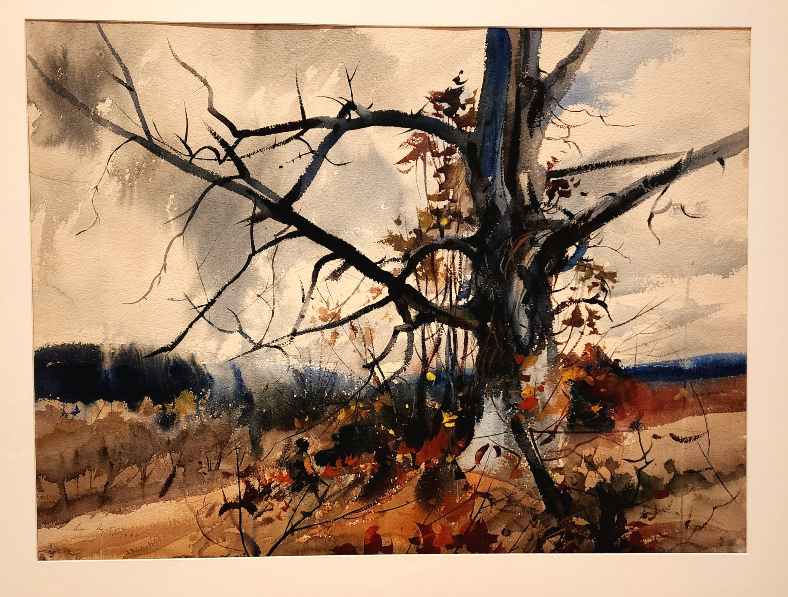
As much as I appreciated dwelling on Public Sale, these next two Wyeth paintings really took my breath away, largely because of their mastery with charcoal, graphite, gouache, and watercolor.
Everything in The Last of Autumn is a prelude to the tree: a dark and dying thing ready for the winter. The tree itself divides the picture plane into a diptych: autumn on one side, winter on the other. Like Public Sale, The Last of Autumn tells a story of change on an emotive level. It’s almost a magic trick: at first, the picture is lovely: mysterious, ethereal, really neat. But the more you look at it, the sadder, more mortal it becomes. This is an end more than a beginning.
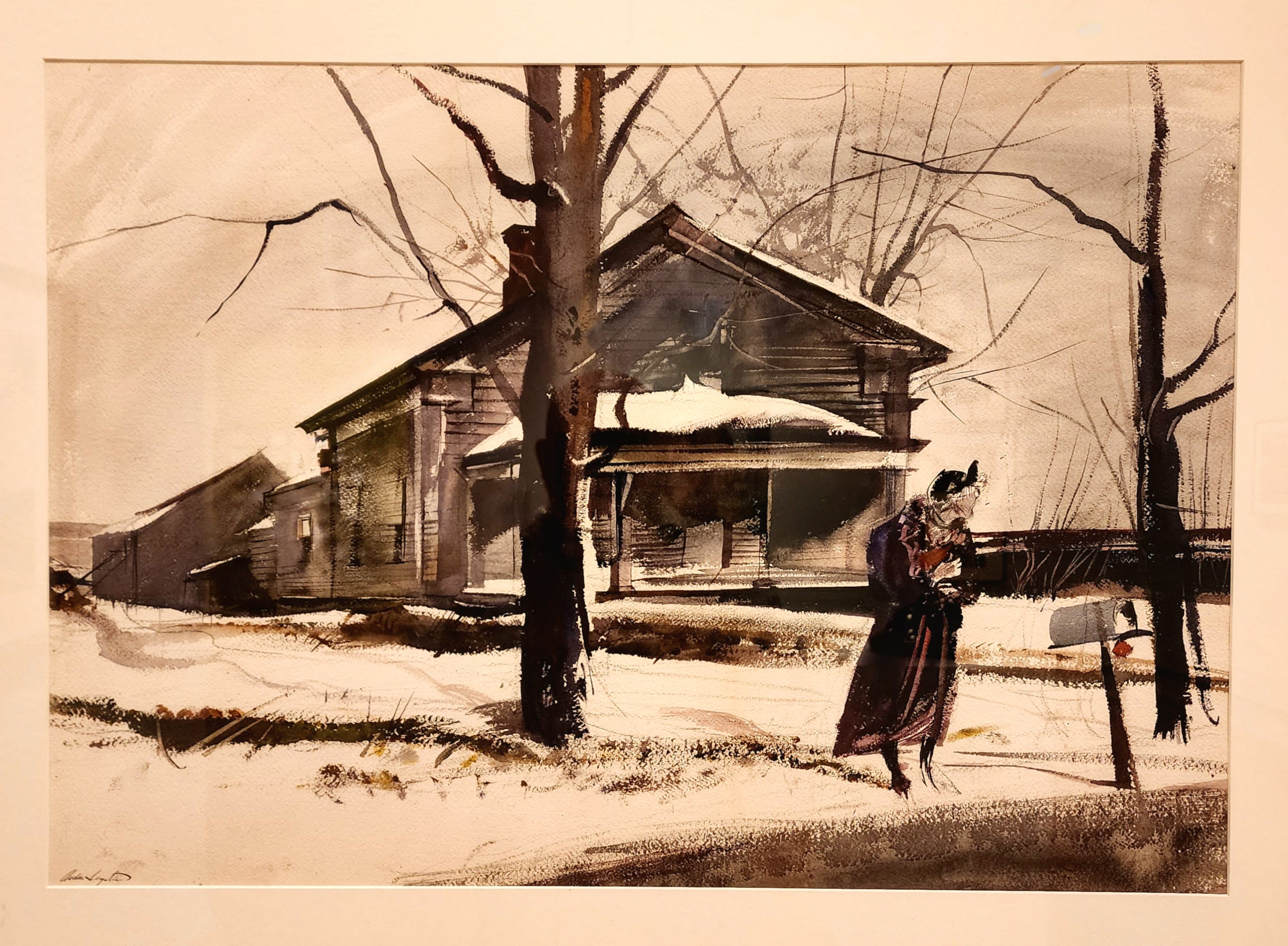
A similar theme can be discerned in Waiting for a Bus. This is clearly an old woman, dressed to the nines. But she is waiting for a bus: not a chauffeur. It is not even clear if the land in the background is hers; although her shadow points us to it, there’s a suggestion in the snow that her footprints come from the left of the picture. The mailbox is empty, begging the question if she is alone with no expectation of enduring relationships. Despite being faceless, the emotion exuding from her body - how she stands, how she waits, how she clutches her coat tightly to her bosom - are all telling.
And let’s pause on the buildings. Again, these are not the manorial homes of the well to do - these are blue collar buildings, where home and work and livelihood are confounded into one. I want the buildings to lead me to the old woman. But in reality, with their roofs slanting violently towards the left, they lead me away from the woman and ultimately away from the picture. Again, this is not the beginning of a journey on a bus; this is an end, and an end into oblivion where the woman will not be remembered. Indeed, we don’t know who she is, and her faceless features only remind us that she simply does not, or rather, no longer, matters.
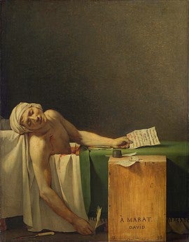
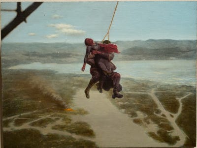
A nod to Jacques-Louis David?
That was pretty heavy. How about a detour?
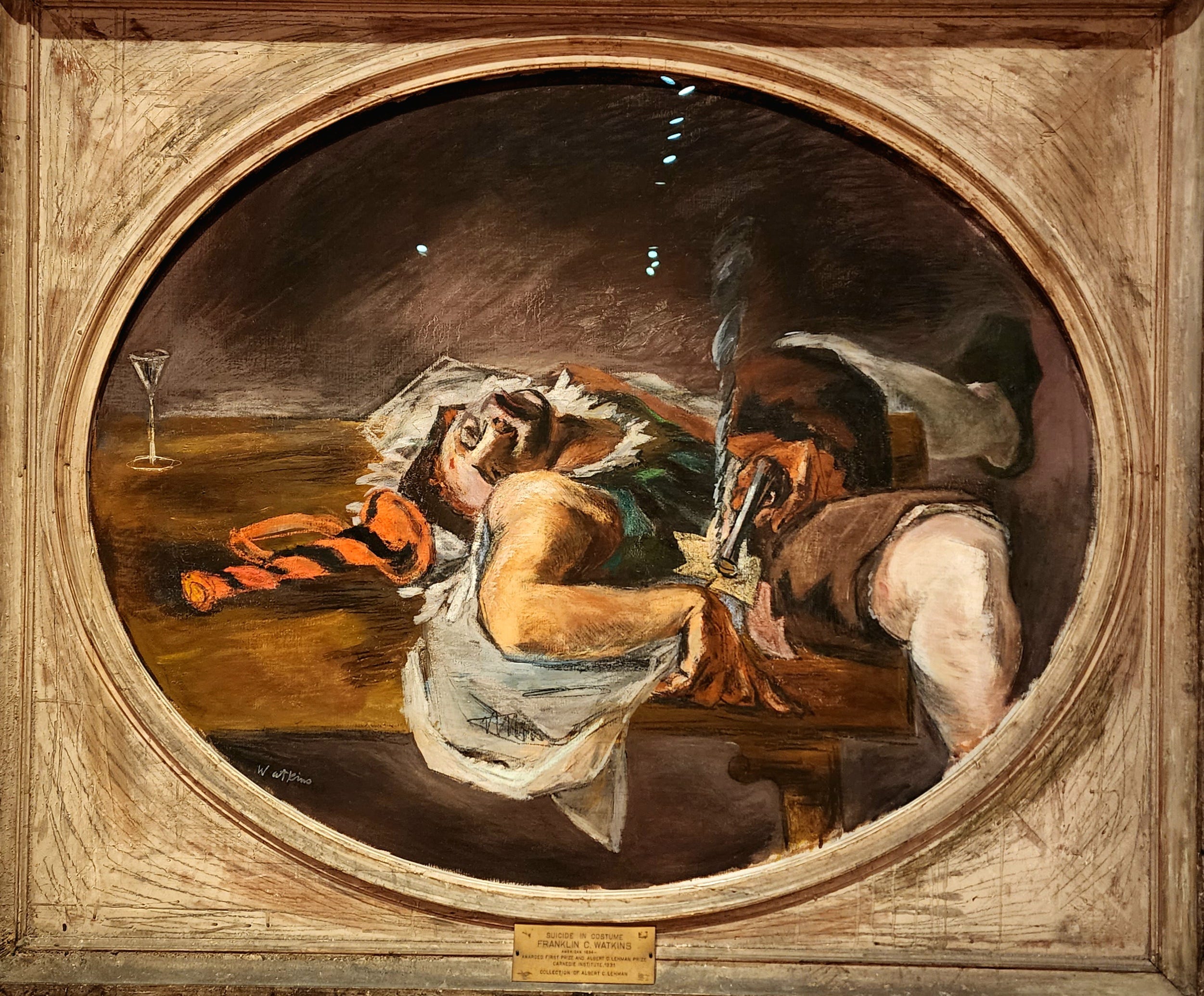
Yeah, I know: not exactly a more cheerful subject matter. So much so that The Westmoreland included a disclaimer of sorts for this specific painting: “This artwork engages complicated ideas, most prominently suicide. Dialing or texting 988 connects to the national Suicide & Crisis Lifeline…” Incidentally, I like how they handled this: they neither removed the painting nor did they ignore the implications of showing it. Art matters; art is powerful. Images can affect us in ways that we cannot always anticipate. This disclaimer acknowledges that without diluting the power of the painting or ignoring the gravitas of its imagery.
This particular painting is considered by some art historians to be a major turning point in American art. As The Westmoreland put it:
In 1931, at the age of thirty-seven, Franklin Watkins was suddenly catapulted into the national spotlight when his painting Suicide in Costume won first prize at the prestigious Carnegie International … The choice immediately polarized artists and critics - traditionalists detested its subject matter, avant-garde artists saw the win as a sign of modern progress, and for others, the choice seemed to signal the ascendency of American art on the international stage.
“…traditionalists detested its subject matter…” I wonder how they felt about Jacques-Louis David’s The Death of Marat. Honestly, when I saw Suicide in Costume, David’s famous painting was the first thing that came to mind. I was really surprised that I couldn’t find that connection on the Internet. Does anyone know if there’s a connection here? Or is this just me enjoying some art history pareidolia?
Because if Watkins did have The Death of Marat in mind when he painted Suicide in Costume, what does that say about his intent? Because The Death of Marat is a loaded, revolutionary painting that carries with it the political and societal baggage of an entire erstwhile Kingdom and a blossoming republic.
The Scalp Level School
Ok, for reals, now, let’s talk about something less somber but no less artistically intense, and that’s the work of George Hetzel and the Scalp Level School. Prior to my visit to The Westmoreland, I had no clue that southwestern PA had its own Hudson River School of landscape art. Having learned about it, I am now all about it4.
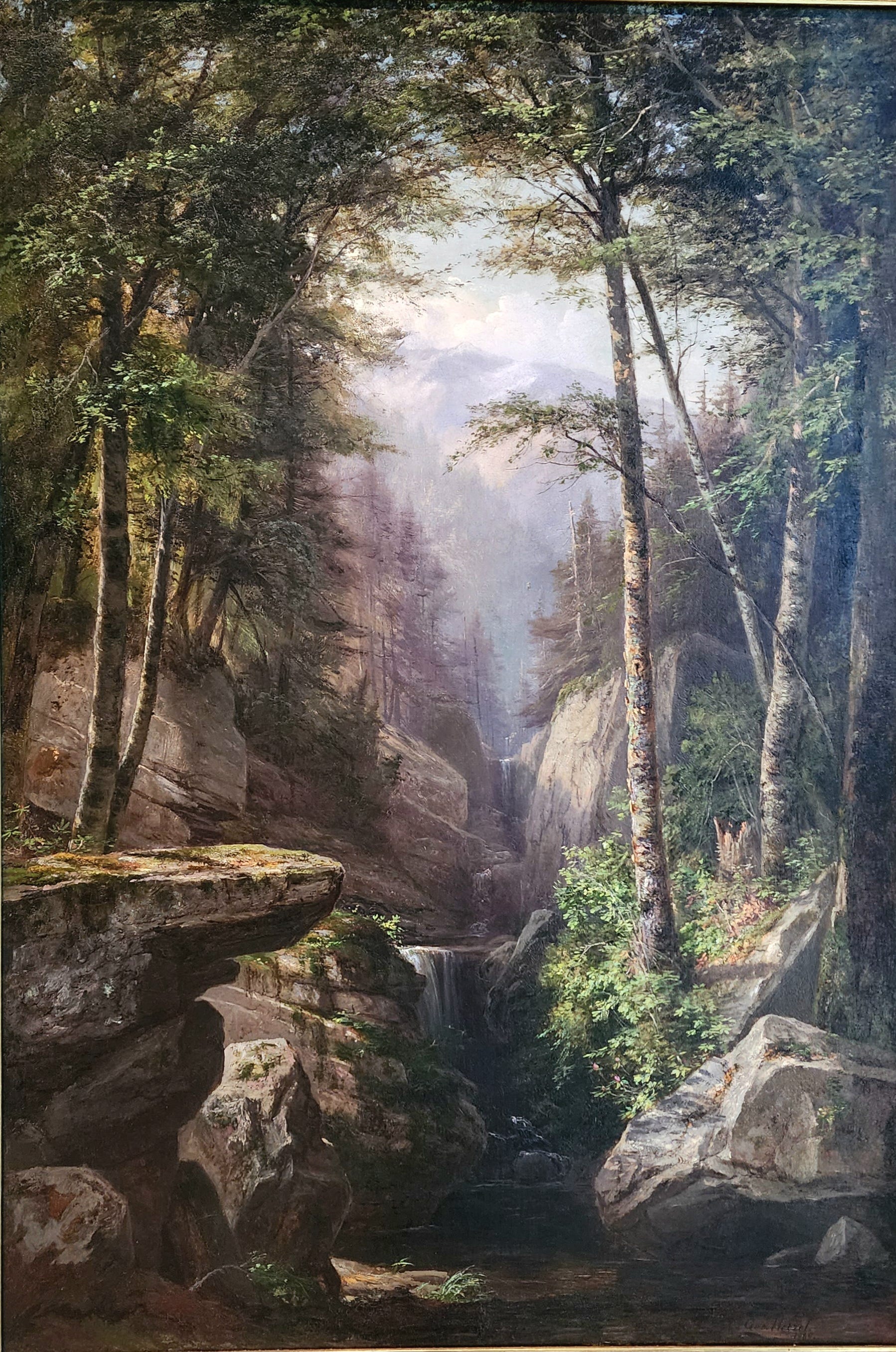
I would be disingenuous if I said that I was drawn to Hetzel and his students’ paintings because they didn’t remind me of the Hudson River School, but that is, if anything, a compliment. Hetzel’s work, and that of his students, are examples of finding beauty in your backyard. This is true of artists everywhere, but to appreciate it you have to juxtapose it against other artists who felt the need/call to go elsewhere, such as to New Mexico or Arizona - or France. There is value in both scenarios; but the Scalp Level School of art reminds us that inspiration is a matter for the eye, not the locale5.
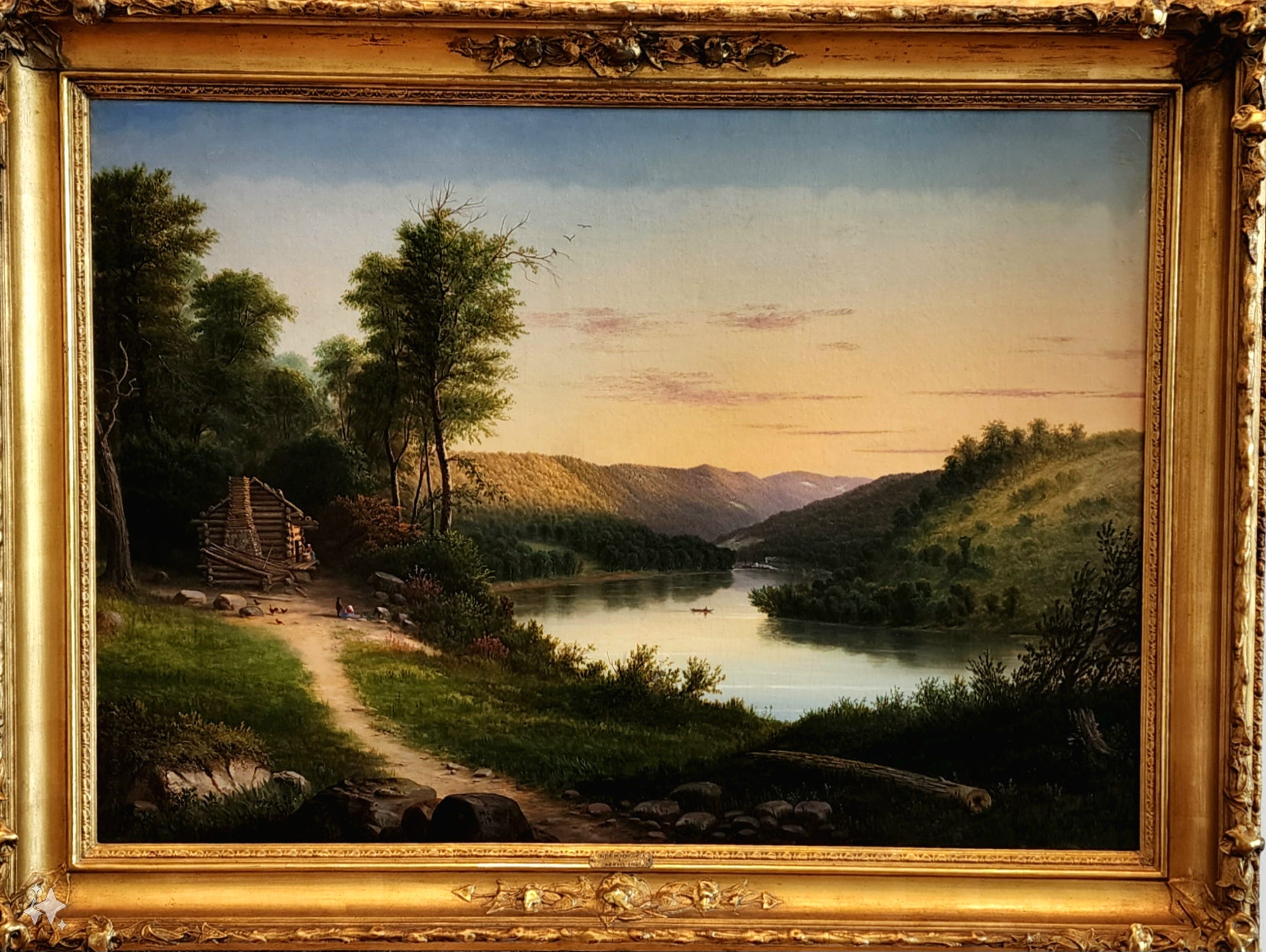
There was also something about the paintings from this school that I can only describe as “time travel.” Consider this painting by Wall titled On the Monongahela. See, if you were to look at a painting of, say, Bear Lake by Harrison T. Groutage, and then were to go to the very spot that he painted, you would see essentially what Groutage saw. This is not true for Wall’s painting of the Monongahela River. This view of the river simply no longer exists. For whatever reason, I find this both captivating and fascinating.
Economy of Stroke
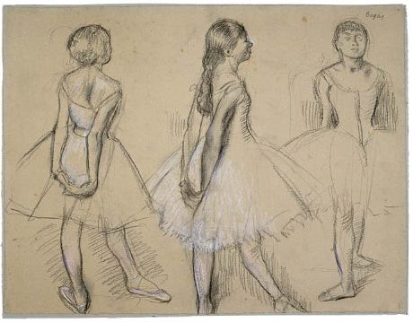
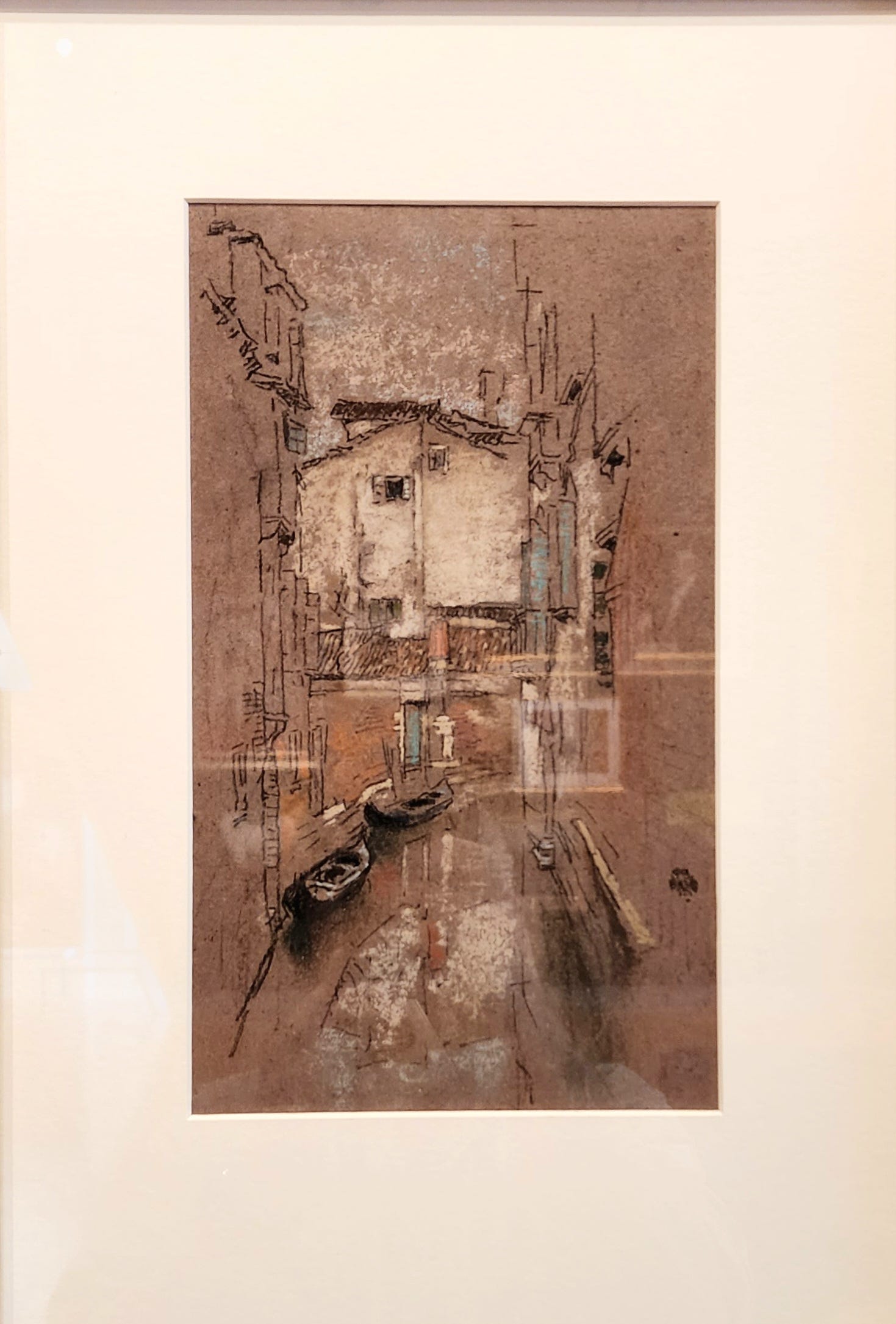
One of my goals as an artist is to be deliberate in my work. This means, among other things, painting or drawing from a philosophy of economy of strokes (or marks, or whatever). In a nutshell, this means that 1) each brush stroke matters; 2) each brush stroke is deliberate; and 3) I use the fewest brushstrokes possible to get the best effect6. Almost all of the artwork I’ve featured above demonstrate this economy. But I want to highlight three in specific that captured my attention for several minutes because of their economy (ie., independent of their composition, subject matter, etc.).
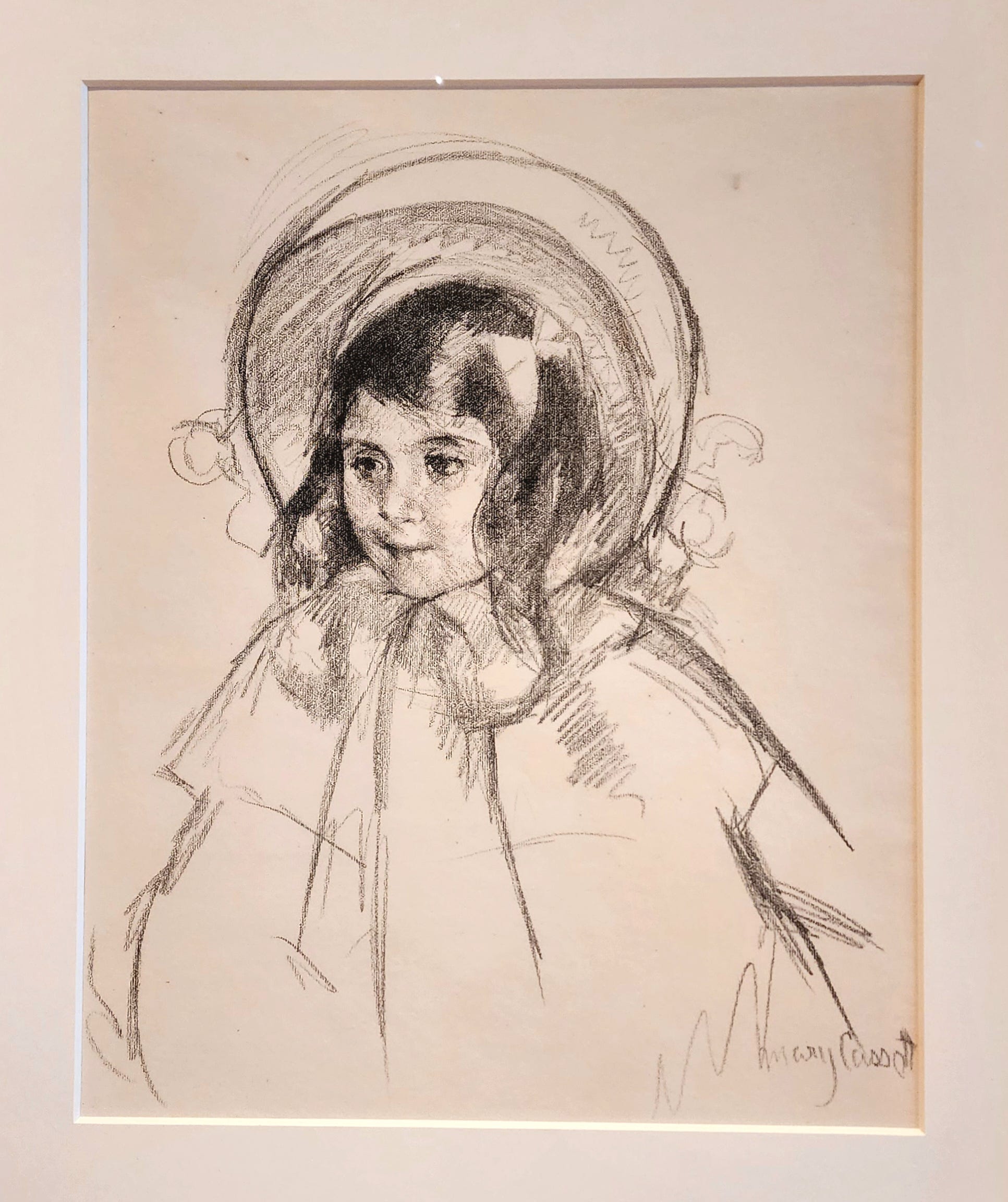
Let’s start with this adorable portrait by Cassatt. Take a moment and try and count how many times her pencil touched paper. Because you can do that within a reasonable degree of confidence. Yet the picture is so complete.
My figure drawing professor once suggested that I study the drawings of Degas to help me with understanding how to apply line weight. That in and of itself was a great use of my time. But what stood out to me while I was observing Degas’s works were his economy of stroke: similar to Cassatt, Degas was able to say so much with so little. I’m speaking specifically of his rough sketches which were often created in medias res and with exceptional speed.
There’s another great example of this economy of strokes from James Abbott McNeill Whistler. This picture, however, is more than a drawing, adding a splash of color with watercolor. I love this “ink and wash” study. It’s so energetic, and so complete, yet is utterly barren, relying largely on the tone of the paper for much of the painting’s local color7.
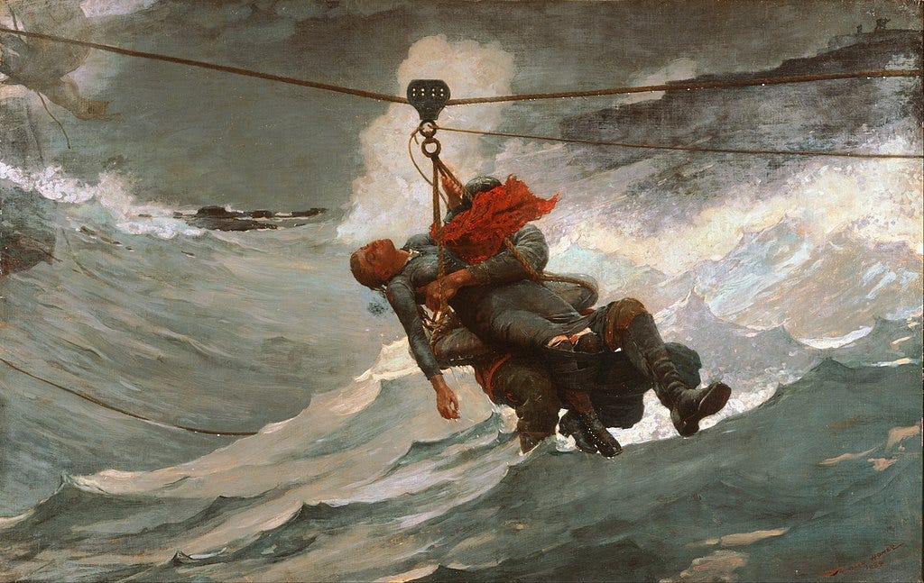
And taking it one step further, this piece from Winslow Homer is fully painted, but with an extremely limited palette. More so, it is composed of mostly simple shapes and silhouette. The story that this picture generates with such limited colors and shapes is enormously engaging. There is no optical distractions here; no over-stuffed Rococo motifs. It is an honest painting that carries its complexity despite - or perhaps because - of its simplicity.
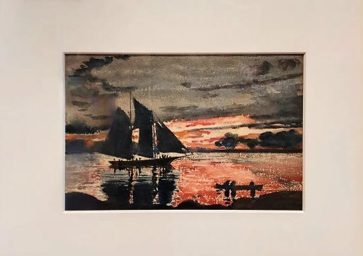
Economy of stroke is more difficult to attain than it may appear. It takes a trained eye, practice and experience (with guidance and feedback), an understanding of anatomy/geography, and - and this is the most important part, in my humble and correct opinion - it requires guts. You have to have the stones to put paint to canvas (or pen to paper) and, with a few simple, directed, and deliberate strokes claim representativeness8.
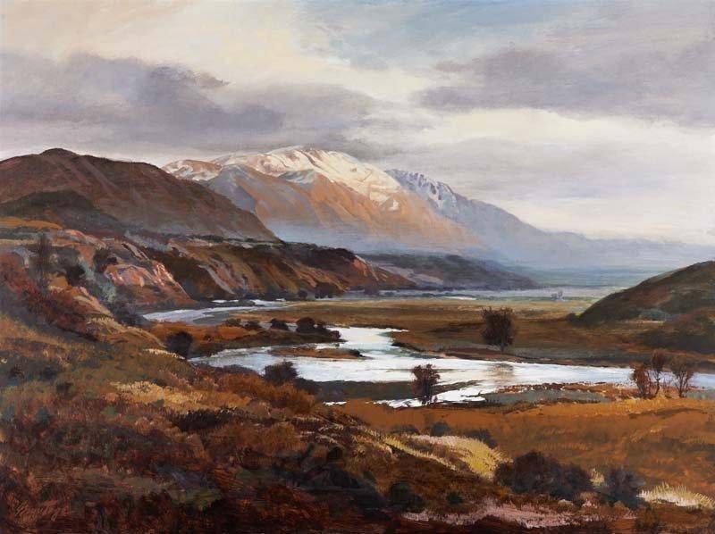
The closest I have come to this is probably this study I recently did as part of an exercise from Jean Haines’ Atmospheric Watercolours:
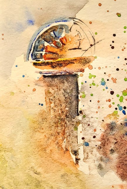
I showed it to a few people, and no one was really clear on what it was :) And honestly? I’m kind of ok with that, because I really like this one, regardless.
A random interlude
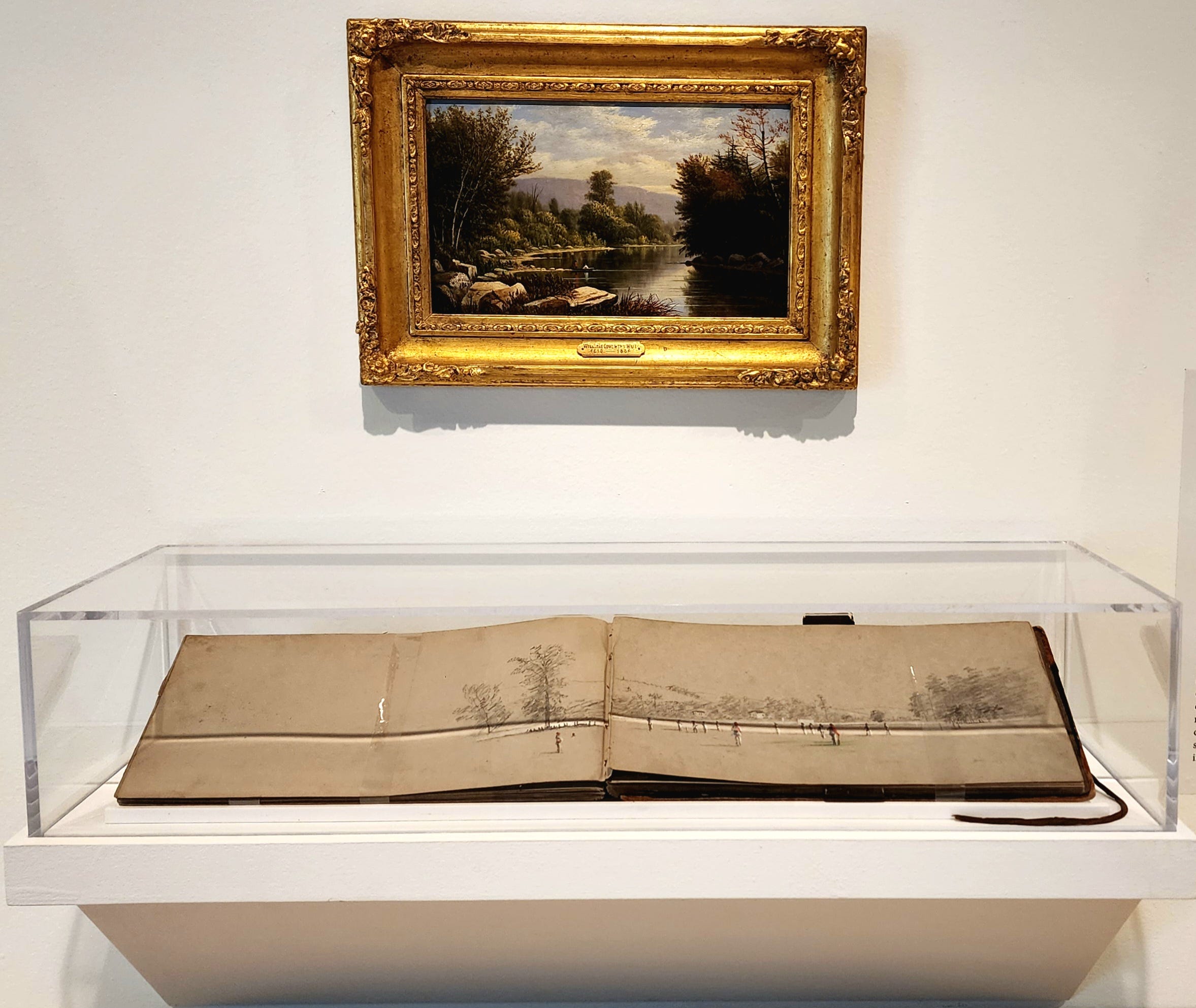
Speaking of studies, I adored this display. (This was tucked away in the same gallery room where they stored their numerous Pennsylvania Dutch Frakturs.) This is another example of my new obsession (the Scalp Level School), and another testament to the importance of keeping a sketchbook for planning, playing, and making mistakes and experiments.
Regional Nods
The Westmoreland, appropriately, has several dozen works - and at least one exhibit - dedicated to regional pieces. For Westmoreland County, as well as Indiana, Cambria, Butler, and Allegheny counties (to name only four more), the most regional thing to portray is, reasonably, mining and industry. I generally associate those two words with filth. No judgment in saying this. I grew up in a coal mining community with a major power plant and coke plant. What I mean is when I think of beauty, mines and big smoke stacks ain’t it. Van Gogh may have found beauty in such conditions9, but I’ve lived in southern Belgium, too, and there’s a reason why Charleroi (the one in Belgium not Pennsylvania) and Pittsburgh and Birmingham (England) are all sister cities.
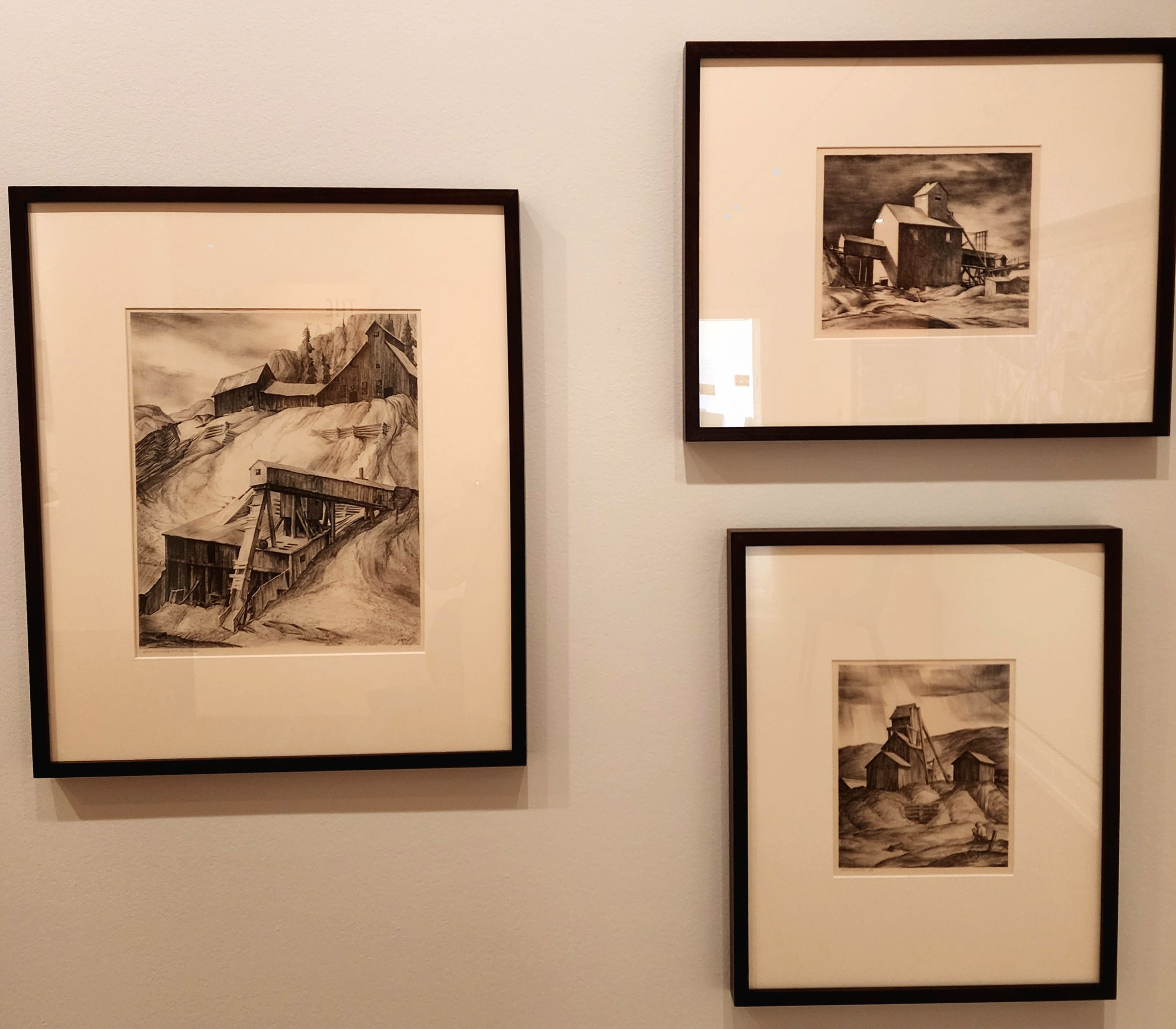
Still, I found several portrayals of industry and mining deeply compelling. These drawings by Wilfred Readio are wonderful pieces of art. Besides being a clinic in contrast, they use an almost journalistic tone: these pieces present the coal mines as they are, that is, dark, somber, utilitarian. Nature fades into the background as industry invades the hillsides and strips away the trees. The mines simply exist: they are as much a part of the landscape as the flora they are replacing.
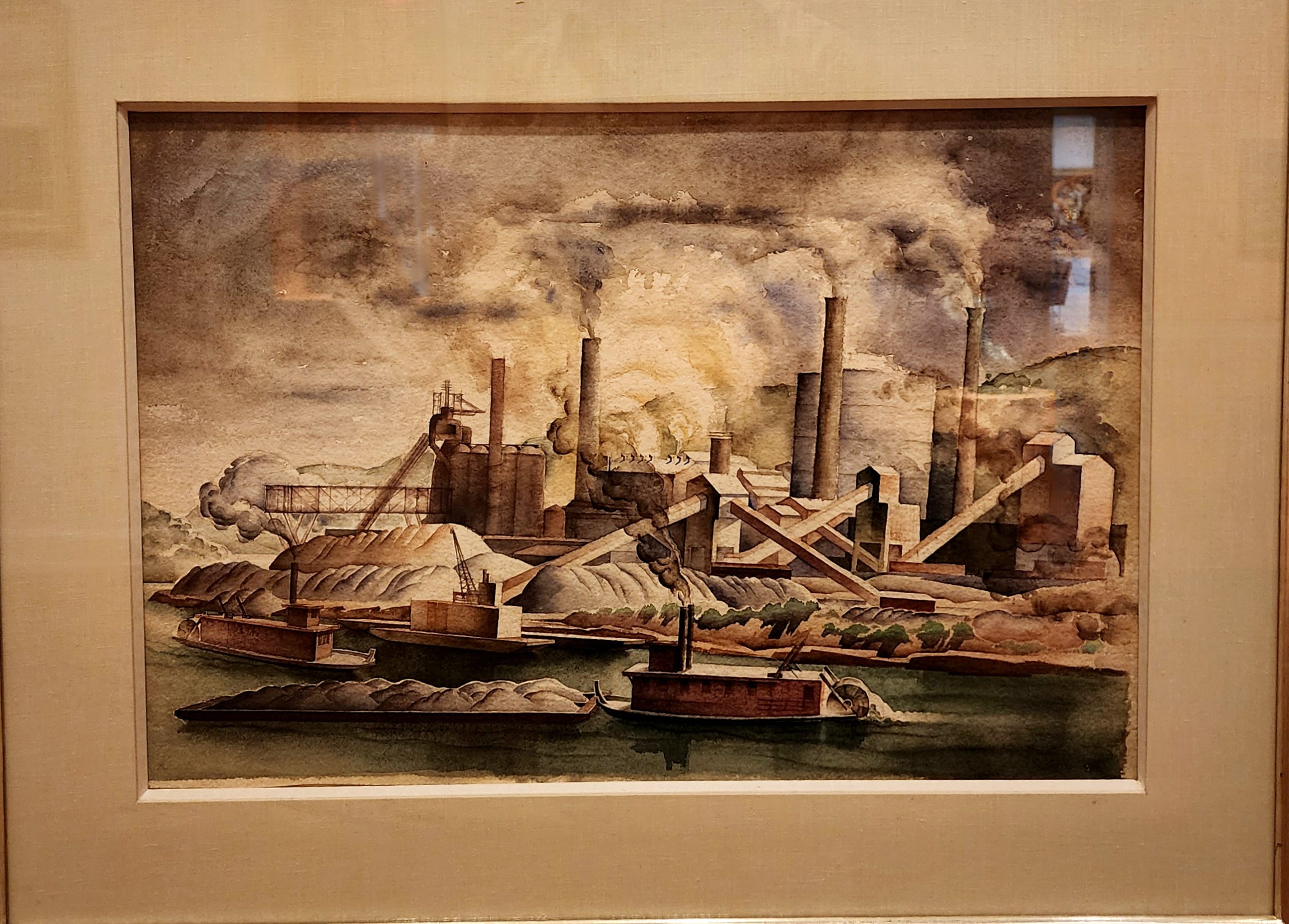
One regional piece that really caught my eye was this one of Pittsburgh by Kindred McLeary. The energy of the painting sets me somewhat on edge. Which isn’t helped (or, rather, is helped) by the busyness of the composition. How the image leans also speaks to this vibrating energy.
The color choice is important. It is, in a word, dirty. It really demonstrates the subjugation of the environment by industry, and the effect of commerce on the natural world. Pittsburgh (and Charleroi and Birmingham) are cleaner, today, but their industrial past is far from invisible.
Taken together, the regional work reminded me that there are layers to enjoying or appreciating works of art. These are not going to be the sort of art that I personally will return to for inspiration or pleasure, but that does not mean that - when I do see them - I can’t glean considerable inspiration and even pleasure.
Coda: Potpourri
There were a handful of paintings that I just enjoyed because I found something about them delightful, whimsical, or engaging.
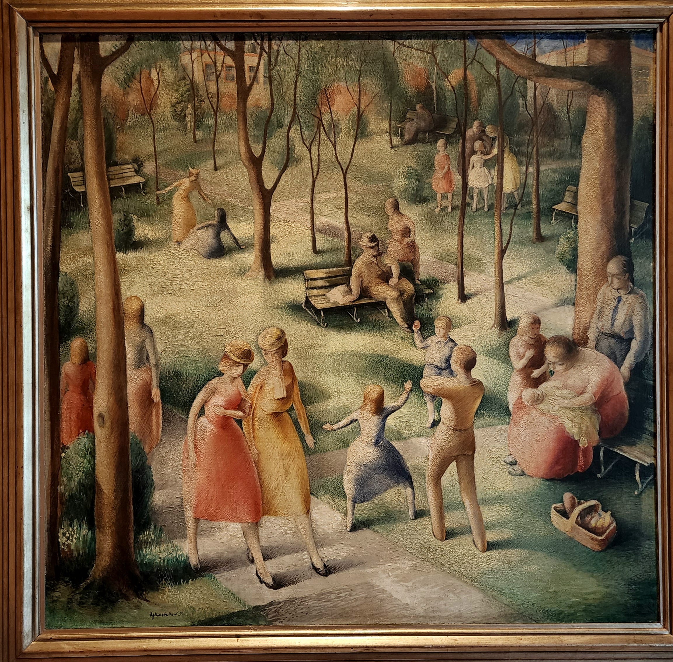
First is this congenial piece by Alexander Kostellow. What first caught my eye in this painting was its diagonals, both explicit and implied. The entire painting is a patchwork of crisscrossing lines generated by the careful positioning of shadows, benches, and lawn. This in opposition to the strong verticals created by the trees and people. The people are especially important because unlike these powerful angles, they offer a gentler, rounded image that makes the entire painting peaceful.
However peaceful it appears, though, I admit that there’s something off-putting and uneasy about this painting. I can’t put my finger on it, but the body language of many of the characters is skewed, creating a malaise. There’s nothing malevolent going on in the story, here, but there is a “cliquishness” that betrays the otherwise peaceful scene of community and neighborliness. It’s people going about their business among strangers going about their business.
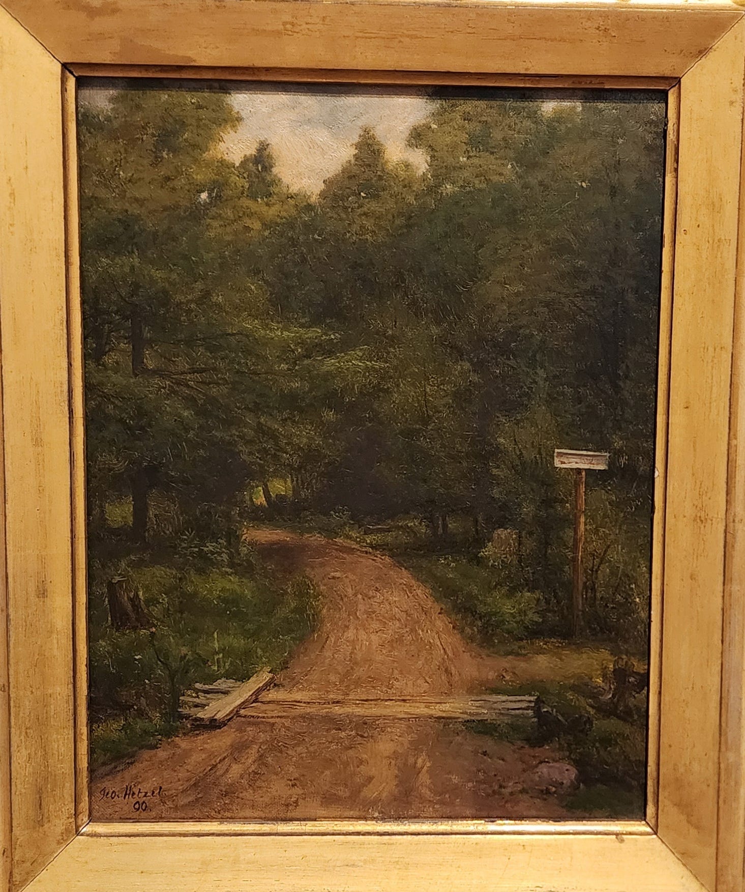
This is another piece by Hetzel and therefore falls under his Scalp Level School. This composition is less dramatic than much of their landscape work, but no less awe-inspiring. And it’s not the road that meanders right off the canvas that captures my attention: it’s how the log (which acts as a sort of culvert) interrupts the entire flow of the composition. Between the overpowering vertical of the dirt road and the natural effect of the portrait orientation, my eye should want to go straight up and out of the picture plane, exit stage right.
But the log breaks this flow rather abruptly, and pushes me over to the otherwise easily missed trail on the right. This is encouraged by the sign. I really love this level of subversion in a painting that, at first glance, was uninteresting. It literally invites us to take the road less traveled. What a wonderful painting.
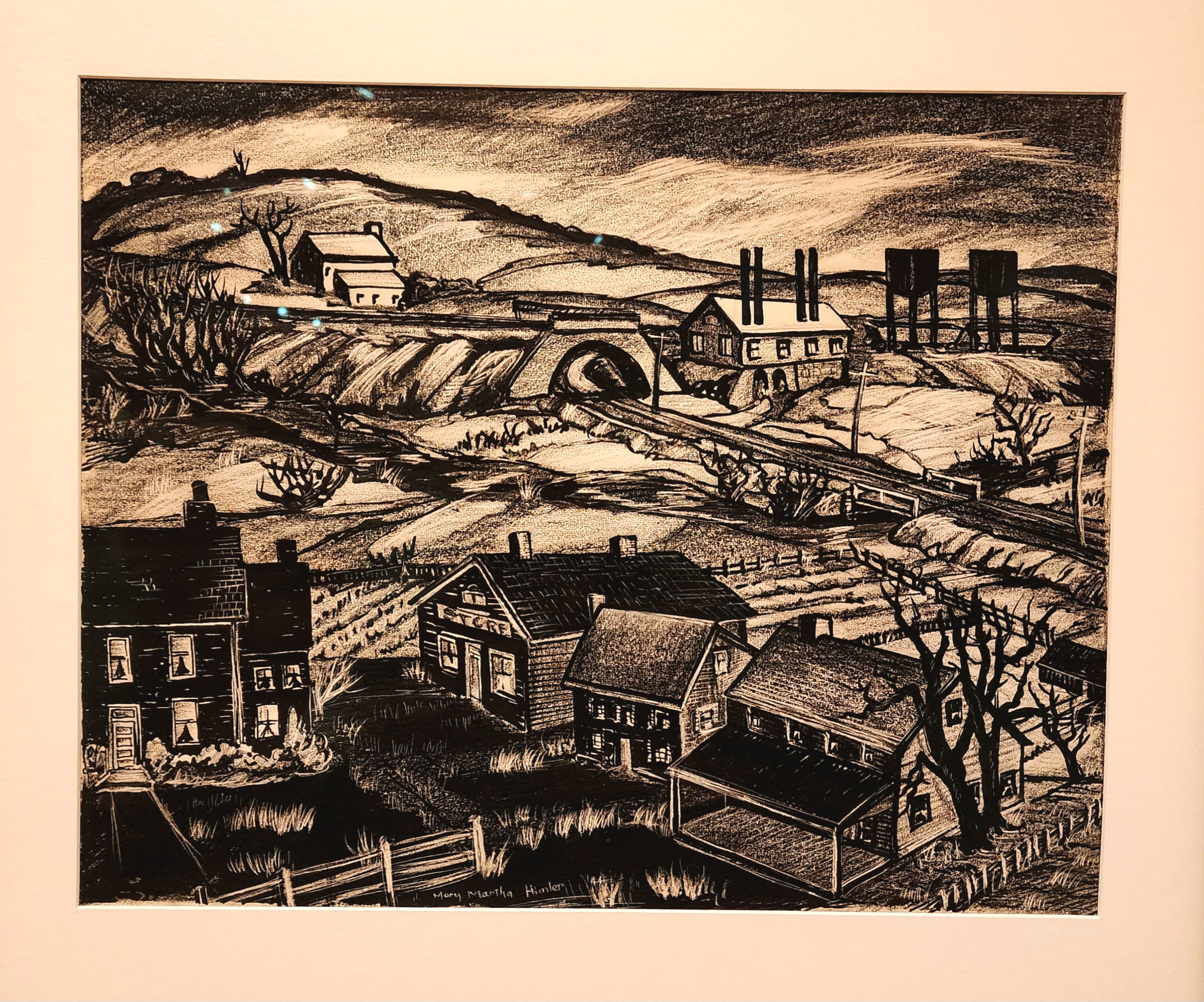
Finally, there’s this great drawing by Himler. This piece fits under the category of “regional work” as I discussed above, but that’s not what I enjoyed about it. It may be silly, but what I loved about this piece were the windows. Despite there not being a single figure visible in the windows, you can still sense liveliness and action. It’s almost a voyeuresque effect, akin to living in a big city and looking across the street at the neighboring apartment building. How she pulled this off with no figures and seemingly no effort is truly beyond me - but I love and wonder at it!
End of the road
I know, it was a long one. Let me know if you like this kind of long form essay. I don’t plan on doing them regularly, but maybe once in awhile when it seems appropriate, such as for museum visits. But at least in this case, The Westmoreland Museum of American Art really deserved a big treatment. What an incredible museum! I can’t wait to return.
In statistics, we’d call this a constant. And as any statistician will tell you, constants only muck up an equation. So it’s best to just remove them from an equation if we want to actually learn something.
How did I miss that the Wyeth clan was from PA? Granted, from the Philly side, but still.
This is just one example. Fortushniak has a more recent series based on his reactions to the war in Ukraine that are even more potent and poignant.
Ok, fine, technically the Scalp Level School is not, strictly speaking, a school of “landscape” art. But that’s what stands out to me more than the still lives and dead birds, so that’s where I’m going with it.
Thus Robert Henri telling Minerva Teichert, an Idaho native who was studying with Henri in New York, to “tell the Mormon story”, eg., not the New York story.
Think of it as the visual art equivalent of Zinsser’s On Writing Well.
You know who was a master of this? Frank Frazetta. Take a look at his Night Stalker, published as the cover for Creepy Magazine (#32, 1970). An enormous amount of real estate on this painting was “just” the natural color of the Masonite which Frazetta used for his support.

If you want to see a real-time example of what I’m trying to say, check out this video of Marc Folly painting windows during a workshop.
"Find things beautiful as much as you can, most people find too little beautiful." Ok, VINCE.